I love clocks in Blades in the Dark, and have written about that before. What’s curious is that Apocalypse World has clocks, as do other PBTA games, so I’d encountered the idea previously, but it had never really grabbed me. I hadn’t thought about this much, figuring it was just part of the general Blades awesomeness, but it jumped out at me as I started prepping for an Urban Shadows game I’m running.
So, Urban Shadows has a pretty neat campaign planning trick called Threats and Storms. There are some guidelines for types of threats and what they do, but structurally, the threats have a 6 step plan that starts with a promise of trouble and culminates in trouble, and the threat attempts to advance the plan, moving through the steps. Tie a couple of these threats together and you’ve got a Storm, and you’re ready to go.
 This is a pretty good model. Good enough that I want to fiddle with it, but that’s another post. But there is one element of it I did not like at all, and that is the physical presentation of it, and it illuminated something about clocks to me.
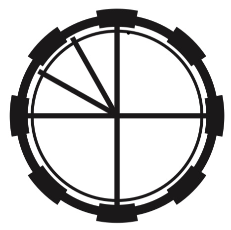
See, Urban Shadows uses Clocks to illustrate this idea, and specifically it uses the Apocalypse World style clocks of 3 quarters followed by 3 twelfths1.
It then maps each step of the plan to a wedge of the clock, which is simply more information than the clock can hold, so it required secondary notation, in a style like this from the Threats sheet.
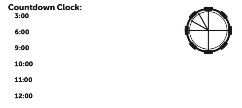
Urban Shadows countdown clock sheet excerpt
Now, this is not broken. It can work. But to me, it’s like watching someone drive a nail with a wrench. It’s a mismatch of tools – I would expect the construct that I’m using to track these things to be able to contain them.
As an example, Monster of the Week has a similar model of threats called “Arcs” – six step plans leading to badness – but it lays it out in a tabular format, with falling darkness as its framing metaphor. This does not look as cool as the clock, but it is rather mor functional. And, in fact, when I ended up writing my threats (by hand), I used a worksheet rather more like MOTW, because it gave me enough room to think as I wrote, rather than focus on squeezing things in.
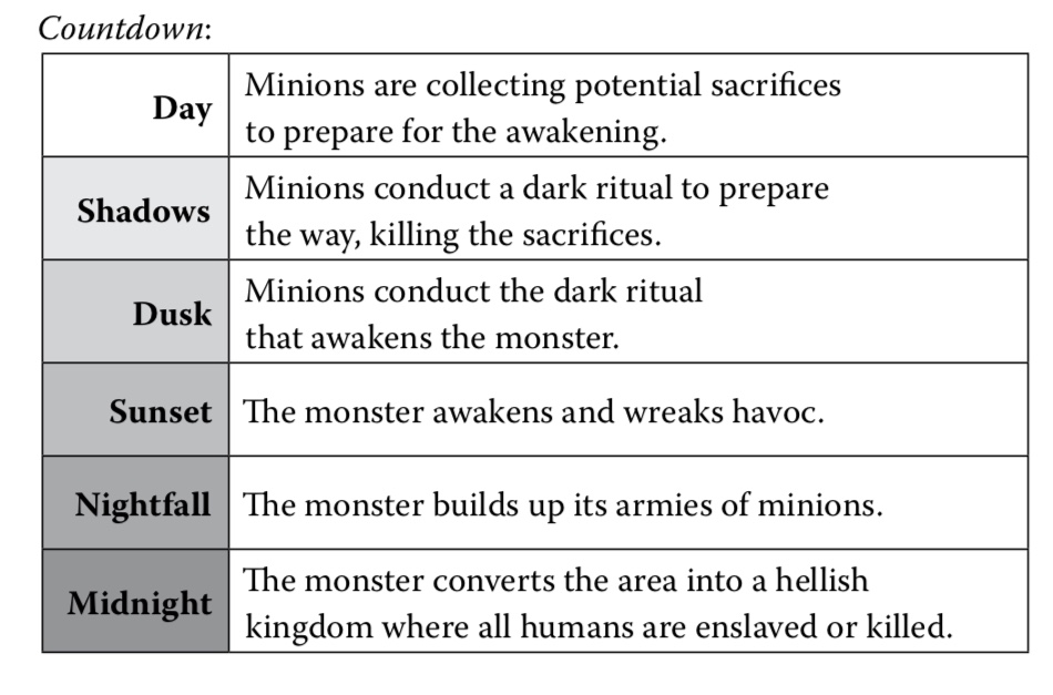
An arc example from Monster of the Week
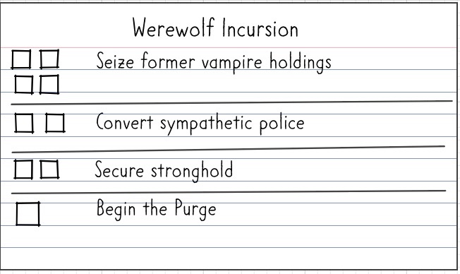
Doing that, gave me an insight into what I like about BitD clocks, which I can illustrate with these two images
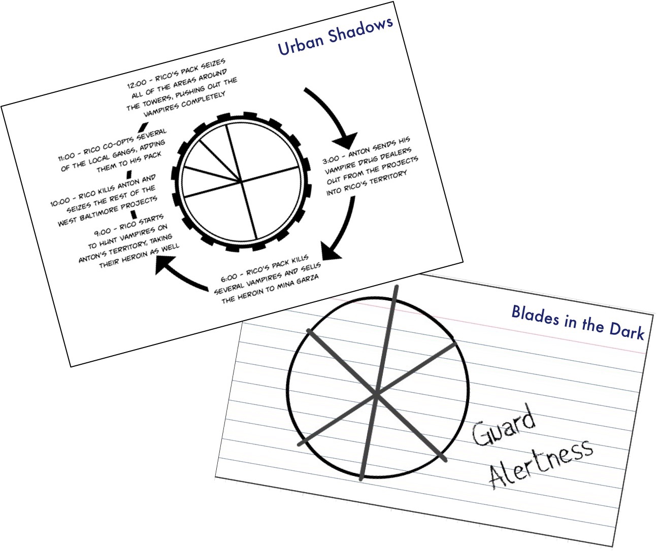
I am not holding this up to say the Urban Shadows clock is bad, rather to highlight how they’re used. The US clock is information-dense, with triggers and information at every step along the way. The Blades clock is single purpose – it has one consequence, and shows progress towards it (there are tools to make them more complex, but this is the default).
For what I use clocks for (which is a BIG qualifier), I really enjoy the clarity and focus that a unitasker provides. It makes it useful for communicating to the rest of the tables (something that’s trickier with a keyed clock) and it allows me to go immediately from need to implementation without needing to stop and fill in the interstitial spaces.
There is also a practical element of ease and flexibility – blades clocks are easier for me to draw, especially with different values2. This is far from insurmountable – we’re talking the difference in drawing a few extra lines – but when I whip out a sharpie at the table, it matters to me.
So that’s why I like BitD clocks so much: they’re flexible unitaskers, and that aligns with my needs.
But, importantly, this is not the fault of the tool. The 3-and-3 clock is a great model if you want to have an explicit upshift or escalation. When I use a clock like that, I would not want to add a note or progression for every wedge – rather I would just want to explicitly note what happens when the escalation happens, since that’s the explosion, the limit break, the point when things go from bad to worse. That’s a great moment, and while that’s a little more work on my part, coming up with a second data point is a lot easier than coming up with 6 of them.
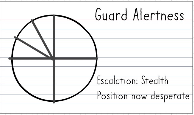
Curiously, this also calls out why I like using tracks3 and trigger tables rather than clocks in certain situations. When I do want to have more context for the clock’s wedges or I want to do something weird with the progression through the clock, a track has the explicit advantage of giving more room to write. Small thing, but kind of important to me.
- Some people don’t like that style of clock, but I actually dig it for its purposes. It’s ultimately just a 6 wedge clock, but it’s got an implicit flip over from yellow zone to red zone when you get to the last quarter. That transition is a neat piece of information implicit in the layout. ↩︎
- Though, aesthetically, the AW/US clocks tend to look cooler in printed form, and so they work better on worksheets and prepared material. That’s a non-trivial benefit, especially for handout-heavy games, like many PBTA games. The value of cool should not be underestimated. ↩︎
- That is, a series of boxes rather than a circle. ↩︎
Pingback: More on Countdowns – Twisted Cities
[ Eyes open wide. ]
So simple…I love the trigger table! I am totally stealing that for tracking faction response in Blades.