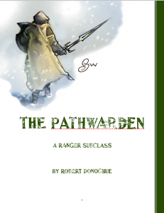
 The Dungeon Master’s Guild experiment continues! It turns out that creating 5e hacks is an effective way for me to fidget, so I rolled out another subclass, The Pathwarden, this time for the Ranger. It’s fun. I like th ecover image a lot (it’s most of why I did it) though I admit the font more or less screams “2003”. This was not any kind of money grab (though I’ll have you know I have earned over 5 whole dollars – big time now!) but rather that it struck me that I wanted to throw in a second fish, and as it turns out, I’m glad I did, since I learned a few more things.
The critical bit is this: because the “publisher” for everything on DM’s Guild is The Dungeon Master’s Guild, there is no systematic way to connect the two pieces I submitted. If you search for my name, you’ll find them, but that requires that you know to look.
So why is this critical? As the site grows, there are eventually going to be only two ways to find things – top lists (like hottest titles) and search. That introduces a number of interesting challenges in an of itself, but once someone finds one of your pieces, how are they going to find any others?
The most obvious answer to this is some sort of consistent naming, probably supplemented by consistent branding. “The Pathfinder” and “The Grey Tyrant” have no connection, but if they become, for example “Fivefold Paths – The Pathfinder” and “Fivefold Paths – The Grey Tyrant”, then we have kludged together a keyword. This is a bit of a hack, and I expect that in time DM’s Guild will add an extra field to DM’s Guild products to act like publisher does on the other sites, but there’s no telling when such a thing would happen.
Beyond that, “branding” would be best accomplished with a consistent look and feel – using a uniform cover page template for example. Think of all the faux book covers you’ve seen on PDFs for examples of how this is done (and how it can go wrong). You want your book to be quickly recognizable from its thumbnail as yours.
Though I note, the image of your book need nto be the actual cover. I imagine you could do something clever with the cover images without messing with the books. Hmm.
Anyway, the bottom line is this is something I did very badly. My two pieces look like I just tossed them up there, because I did. So I suppose the next step is to fix it.
Now, If I were smart, this is where I would hand the task over to someone with actual skills in this area, someone with a good eye for layout and graphic design. And the thing is, I absolutely have access to such people, but that feels like it would be cheating, at least for the moment, because part of the intellectual appeal (to me) is to see what I can do with my simple skills and simple tools.
So the upshot is that I need:
- A word or name that I can use consistently, but which is not too intrusive in the titles.
- A consistent look to the covers. That will require picking:
- Some sort of template image
- A color scheme that stands out (that is – NOT RED)
- To update both entries to reflect this.
So, I guess we’ll see how this goes.
No way to post images? Sorry for the long link:
[HUGE LINK TO THE ONE BAD EGG LOGO SNIPPED]
It has been mentioned, yes. 🙂
I am a frequent buyer on RPGnow. I agree that searching could be better on the site. But I have learned to look for the author’s name which is linked under the “Product Information” on the right-hand nav bar. Of course, in WotC’s version of RPGnow, I only see the four items you have published for D&D.
Thanks for sharing your process!
For the branding phrase, maybe invert the Evil Hat brand and go with Good Shoes.
Yeah, probably a bad idea.
Trying to not mix in the Evil hat too much. This is just me experimenting, and in time I will bring my experience back to the Mother Ship. 🙂
“If you search for my name, you’ll find them, but that requires that you know to look.”
I’m not sure why you think this is a problem. If you like a particular product, it’s trivially easy to search for others by the same author — the author’s name is listed right below the title of the product, *and* at the top of the sidebar giving product information (whereas the publisher information is at the bottom), and both are hyperlinked.
Anyway, FWIW, I’d really love to see a complete set of lifepaths for the character backgrounds like the one you posted last year for the Criminal background.