I was watching some clips of Leverage, as I am sometimes wont to do, and I was particular taken by a sequence of supporting characters.
The thing about Leverage is that the crew are very capable, but they also have a code, something that makes them good guys. I’m calling this clarity, but feel free to pick your own word. It’s important that there are two axes, because they provide a useful comparison to the characters around them.
That is to say, if there is someone important to the show who is not a member of the crew, they are lacking in one \of those two categories. Characters who have capability but not clarity tend to be enemies or foils (Sterling, Chaos and so on). Characters who have clarity but not capability tend to be allies and supporting characters (the FBI agents, Maggie, Jack Hurley). Characters lacking in both tend to be mooks or victims, and sometimes marks. It’s all pretty easy to illustrate in a grid.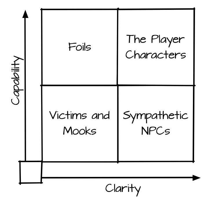
Marks, notably, fall outside of this arrangement because their role is very different. They are often more and less capable than the crew, and may have both more and less clarity. I’m ok with that for Leverage.
Anyway, I’m intrigued by the grid because I want to remember to use it in my own games, specifically to make sure that I have names in every box. It’s easy to remember the foils because they’re so much fun, but it’s worth the effort to remember the sympathetic NPCs. If your heroes have clarity regarding who they are, nothing tests that like someone else trying to live up to the same rules and failing.
But it’s also kind of Leverage specific, since it’s a game where it’s appropriate that the PCs are “up and to the right”. That’s far from common, so I tweaked the model a bit for more traditional games.
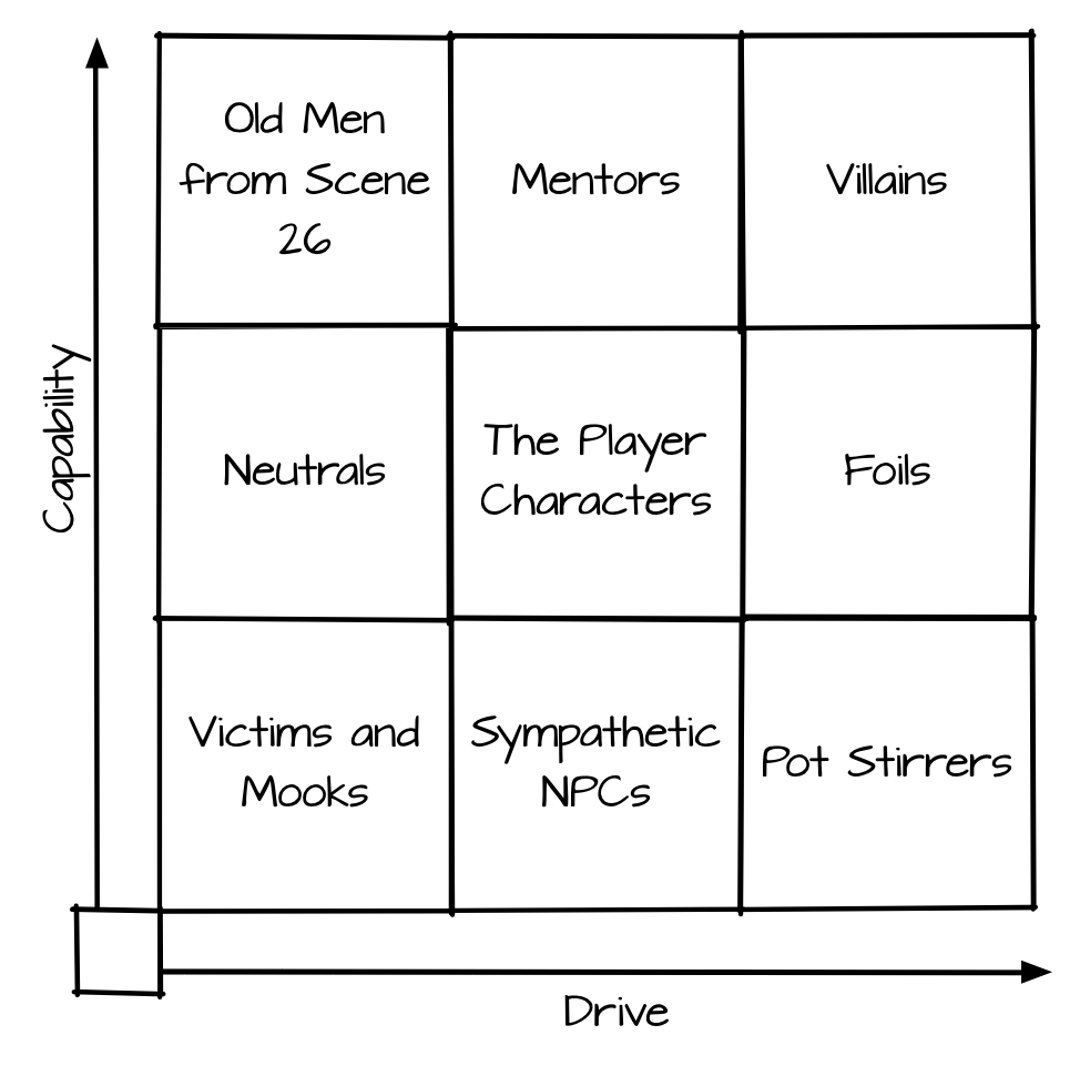
Notably I replaces “clarity” with “drive”. This partly moves away from the moral component from leverage, but it also allowed me to move the foils to the right. 🙂 In this case, drive equates to the strength and direction of a character’s agenda.
The lower left is still largely the same, except the foils have been replaced by neutrals – characters who could act, but choose not to. On paper, these should be the most boring of characters, but in small doses they tend to be quite compelling.
Above them is the Old Man From Scene 26, which is the stand in for overpowered NPCs with no reason to be there. They tend to not contribute much to a game, but some setting shave a role for powerful observers or the equivalent. They may be more prize than participant.
To the right we have the mentors – the folks who are similar to the PCs but more capable. As with the Old Man From Scene 26, these can be a problem, and it’s best to either remove them from the board early, occupy them, or make them a source of trouble in their own right (in the sprit of the elders of Amber).
I put villains in the upper right, which may seem weird, especially since it’s so close to the PCs and the mentors, but consider: what makes a villain interesting is that they are at odds with whatever the characters want, and they cannot easily be turned from that path. Without those two characteristics, the villain is merely a challenge.
Foils re-emerge on the far right – they are as capable as the PCs, but their motives take them elsewhere.
The lower right is the category I’m east sure of – NPCs with little capability but a lot of drive. That is to say – plot hooks. And that’s great as far as it goes, but I’m not sure what I’d do with an NPC who lives in that space.
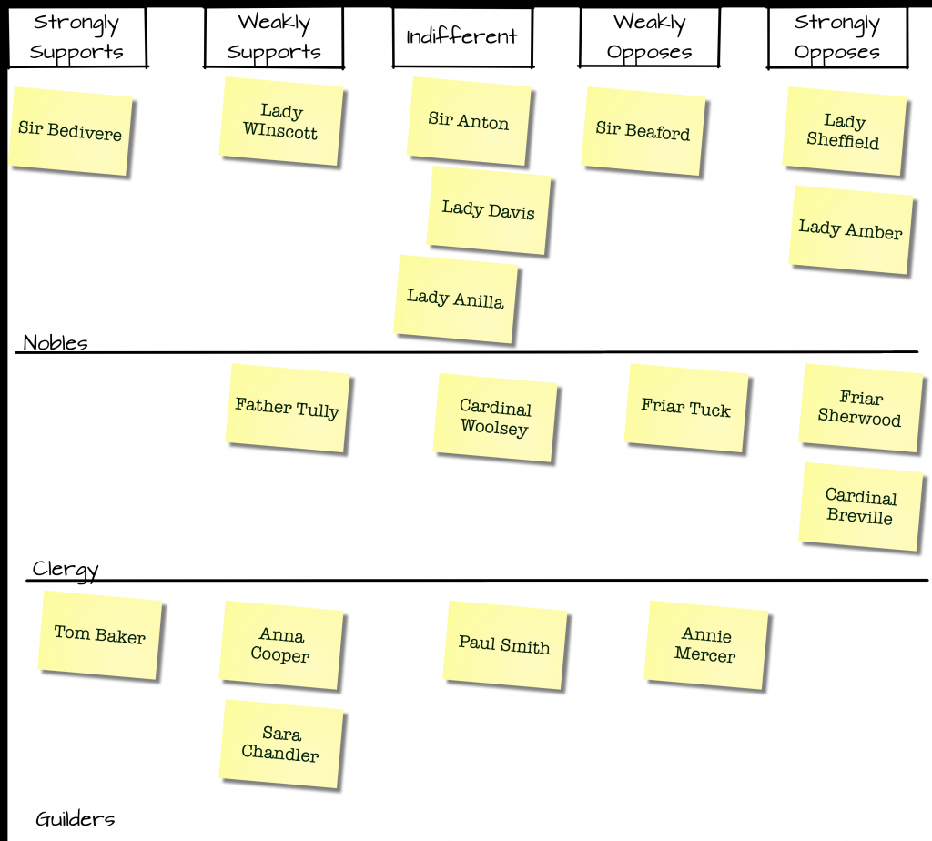
As with the Leverage grid, the utility of a grid like this is to be able to drop your NPC names and see if any gaps reveal themselves. It’s a simple trick, but maybe useful.
 Hopping back to the Elvish Empire for a moment

 So, it’s great that Agile can improve software development, but what the hell does that have to do with games?