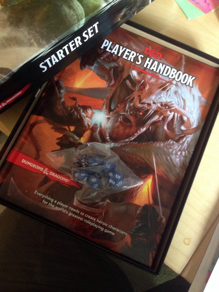
Ok, the meeting I’ve been prepping for all morning just got postponed so I need a break, so I’m going to start up with the Player’s Handbook. I mentioned on Twitter that I have not opened it yet, but I have strong opinions about it. This is no hyperbole. And to illustrate this, I present you with my review-of-the-PHB-Without-Actually-Opening-it-(except-once-but-I-didn’t-actually-read-anything).
1. Binding
 Picking it up, I was a little nervous. The binding feels fat, which is not terribly technical, but I’ll try to explain. There are indentations between the spine of a hardcover and the actual covers which serve as hinges. Depending on how many pages have been squeezed into the hardcover compared to the size of the physical cardboard pieces, you can end up with a book that has a bookblock (the pages) that is not quite the right size for the hard cardboard pieces[1]. Those cardboard hinges give the whole form a little bit more flexibility, but you can feel the difference, and the PHB feels a little big.
This is noteworthy since it’s usually a red flag for binding issues. However, this is why I cracked it open once, and I’m not worried. They bound the hell out of this book. So much so that it’s almost too stiff, but I suspect that will age well. So thumbs up.
2. Branding
I talks about this when discussing the Starter Set – there is more art and less brand than I would expect on the cover of this. This is bold, but I suspect it’s predicated on the fact that, for all Pathfinder’s success. the D&D brand still owns the headspace. RPGs are D&D by default to most people, so they can afford to go very art-centric.
3. Binding, part 2: The Spinening!
When sitting edge out, you see this:
The ampersand at the bottom is nice, but I’m boggled that the small red banner on the front doesn’t wrap.
4. Back Cover
Feel it. Feel it. They did a lovely texture trick that I’m fond of, mixing gloss and matte finishes on the back cover. It’s a small touch, but one that I love. Greatly improves the tactile element of the book.
5. Art
I expect the art to draw a lot of commentary, and lose looking for reasons to criticize it will have no shortage of options. Specifically because the style is more painting-like than the Pathfinder house style[2] (so it has brush strokes and less crisp detail) it’s goign to simply look wrong to a lot of people. It’s also very busy, and emphasizes the monster over the characters, which is an odd choice. I admit I wonder at its cropping, and the Starter Set does make me immediately wonder “is this a crop of a bigger image?”
But for all that, I dig it. It’s distinctive, the sense of motion is wonderful, and I’m pretty happy with the images chosen for the heroes. If I were to really criticize it, my big concern was that I wish the hellhound on the back cover popped more. Red on red makes it more boring than it needs to be, which takes away from my love of the back cover.
5. Price Point
$50. At the thickness, I’d have guess $40 (Hoard of the dragon Queen, also hardcover, is $30), but $50 is not out of bounds for this level of production. Also, I imagine it’s necessary to round up considering how many will be sold at some manner of discount, so a solid $50 makes a lot of sense.
Can’t wait to crack it open.
EDIT: PS – It does indeed fit inside the starter set box
- Which is why softcovers largely don’t have this problem – the cover is sized directly to the bookblock. Hardcover construction is a bit more complicated. ↩
- Because, basically, Wayne Reynolds defines this mental space the same way that Larry Elmore used to). That said, it’s in line with Magic’s general style, and that’s a non-trivial factor. ↩


One addendum, upon opening it. Paper is glossy, but not too glossy. Very nice. I need to find a 4e PHB and feel them at the same time to see if it’s less glossy.
But an interesting discovery – Hoard of the Dragon Queen’s paper is *not* glossy. It still looks great, but I wonder if that played into the price point.
Pingback: 5e PHB Roundup | The Walking Mind
The price break worries me, they print in the usa. Versus the pathfinder players hand book. You get 250 less pages for the same price. Then it’s offered by Amazon for almost half price and this a hard hit for the game store owners.
Finally catching up on these. It’s interesting that you call emphasizing the monster over the characters an odd choice, because when I think back on it, it’s a very common element on the early covers. The original AD&D PHB was dominated by the idol, and the DMG by the efreet. The Erol Otus and the Larry Elmore covers for Basic D&D put a large amount of emphasis on the dragon.
Maybe it’s just nostalgia, but those covers always spoke to me more than the later Jeff Easley ones. (The Trampier cover in particular summed up D&D better than any one before or since.)
Setting DMGs aside (because those totally have a different emphasis) it’s not the monster itself so much as the fact that the monster overshadows the heroes, if only due to size. Admittedly, the idol on the first AD&D PHB is the focus, but that doesn’t be come a trend. Subsequent covers are hero focused (excepting 3e, of course).
That said, this could probably be compared to the Elmore piece on that red box cover. It has a similar issue of scale – the dragon is a bigger part of the picture than the hero. But the angle and the colors make the heroes role more striking and, importantly, position the reader in the picture so that they’re part of the action. This is a similar arrangement (big monster, hero in action) but with less color contrast and more of an observer angle.
That said, so far as I’m concerned, antagonists on a DMG cover is totally in bounds. PHB is just an oddball.